Visualize Trees Using ‘ETE3’
ETE3 (for Environment for Tree Exploration, v3) is a Python framework for the analysis and visualization of trees. It specialized in phylogenomic analysis, but many of its tools can be used for any kind of trees including cellular genealogies. It has a clear Python API and features some advanced visualization tools for trees. Please have a look at the ETE3 gallery for examples and code. For more information on its capabilities, read the paper by Heurta-Capas et al. 2016.
With this framework, we can take the Newick tree format as above and print its structure in text format and export a simple visualization as follows:
from ete3 import Tree
with open('cell_division_newick_cells_0.txt', 'r') as file:
    s = file.read() # read from file
    t = Tree(s, format=8) # read Newick format 8
    print(t) # print tree as txt
    t.render('cell_genealogy.png') # export png image
This results in the following text output:
         /-"6"
      /-|
     |   \-"7"
   /-|
  |  |   /-"8"
  |   \-|
  |     |   /-"10"
--|      \-|
  |         \-"11"
  |
  |   /-"12"
   \-|
      \-"13"
and the following image:
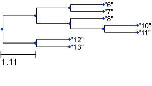
Thus, ETE3 allows you to get a quick tree visualization in a few lines of Python code. However, it also supports advanced tree visualization as shown below. Moreover, it provides a number of tools and metrics to compare tree topologies such as the Robinson-Foulds symmetric difference by simply executing tree1.compare(tree2). Here, however, we focus on visualization.
A more advanced example
With a bit more work styling our visualization, we can generate a much nicer visualization.
Suppose we have a simulation like the one below, with a growing population of cells where mutations occur randomly during division. Clonal populations emerges as daughter cells inherit the mutations, here indicated by different colors.
We export the divisional history using the CellDivision plugin with the write-log option set to the Newick format. This results in a text file called cell_division_newick_cells.txt:
(((("34",(("62",(("108",(("140","141")"136",(((("214",("260",("348",("386",(("448",((("510",(("570",((("662","663")"658",((("1108",(("1170","1171")"1124","1125")"1109")"704",("738","739")"705")"686",("692","693")"687")"659")"582","583")"571")"512","513")"511")"502","503")"472","473")"449")"442",(("578","579")"576", ...
We also export the clone number c of each cell at the end of simulation using the Logger plugin, resulting in logger.csv:
"time"	"cell.id"	"c"
3000	9	50
3000	10	50
3000	11	50
3000	15	50
3000	16	50
3000	19	164
3000	22	164
3000	28	50
3000	31	154
3000	34	154
...
Next, we write a python script to do the following:
- read
logger.csvinto apandasdataframe - read
cell_division_newick_cells.txtusingETE3as before - color-code leaf nodes with
NodeStylethe clonal number from the dataframe - style the tree with
TreeStyleto have a circular layout - export the visualization in
SVGimage format
import os, glob
import pandas as pd
from ete3 import Tree, TreeStyle, TextFace, add_face_to_node, NodeStyle

data_folder = "path/to/folder"

## read logger file
df = pd.read_csv(os.path.join(data_folder, "logger.csv"), sep='\t')

## newick files (there may be multiple if initializing with >1 cell)
fns = glob.glob(os.path.join(data_folder, "*newick*.txt"))

def value_to_hex_color(value, vmin=0, vmax=255):
    '''convert number into hex color code'''
    import matplotlib.pyplot as plt
    from matplotlib import colors
    norm = colors.Normalize(vmin=vmin,vmax=vmax)
    c = plt.cm.gnuplot(norm(value)) # use same colormap as in simulation
    return colors.rgb2hex(c)

for fn in fns:
    with open(fn, 'r') as file:
        s = file.read()
        s = s.replace('"', '')
        t = Tree(str(s), format=8)

        # set node style: background color
        for cellid, clone in zip(df['cell.id'], df['c']):
            # get node(s) with name 'cellid'
            node = t.search_nodes(name="{}".format(cellid))[0]
            node.add_feature(clone=clone)

            # set background color of node
            style = NodeStyle()
            style["bgcolor"] = value_to_hex_color(clone)
            node.set_style(style)

        # set tree layout and style
        ts = TreeStyle()
        ts.show_leaf_name = False
        ts.show_scale = False
        ts.mode = "c" # circular layout
        ts.arc_start = -180-45 # 0 degrees = 3 o'clock
        ts.arc_span = 270

        # export as SVG
        outfile = os.path.join(data_folder,fn+'.svg')
        t.render(outfile, w=1200, units='px', tree_style = ts)
        print('Saved {}'.format(outfile))
If you execute this Python script this styling, we obtain an SVG image of our lineage tree where the tree is drawn with a circular layout and the background of the nodes indicates the different clones:

By exporting the clone number and using the same colormap, the color coding now corresponds to the colors in the simulation:
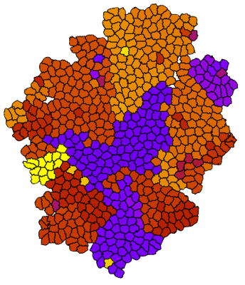
This combination allows you e.g. to correlate the tree structure with the spatial location of the different clones.
If you’re comfortable running Python scripts after simulation during post-hoc analysis, you can stop reading here. But if you’re curious how to execute a python script from within a Morpheus simulation, please read on.